A day without UI
User Interface is one of the more important parts in game design, since it’s ultimately what the player is looking at while they’re playing the game. However, since the advent of the mobile and casual games, people have been arguing about the right way the UI is done.
Some people thinks UIs (including HUD) are a waste of gameplay space and should just be trimmed down into nothing, while the other party insists that HUDs are important and should be a important part of game design.
To discuss this matter, I think posting screenshots are the easiest way to show the difference. The below screenshot came from the first Mega Man Zero game, which was released in 2002.

As an Action game, there are minimum UI, you got a life bar showing your HP, a Rank Rating showing up your current Rank, and your current weapon.
Then there is Mega Man Zero 3, released in 2004:

There are literally no difference at all, aside from an additional weapon icon (since that game introduced a new weapon system. It is virtually, the same game. (Maybe with cooler graphics)
Then we have Mega Man ZX, released in 2006:

There are suddenly more stuff to show on the screen. One of the major differences is because this game was on the DS which has two screens. However, The bottom screen is exclusively used as a bigger UI since there are, again, more game mechanics to cover.
Then at last, we have Azure Striker Gunvolt, which is released this year, in 2014:
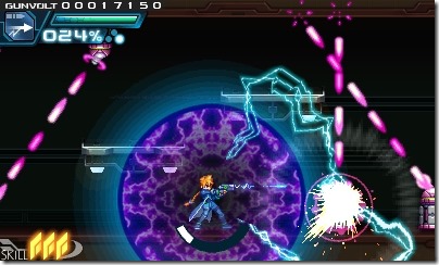
I need to point out that all above games are made by the same group of people, This can also be seen in the game’s similar genre, art style and core gameplay mechanics.
However, the trend cannot be unseen: For an Action game, there are more and more UI Elements on the screen, in other words, more stuff that one should take notice on. It’s not like Mega Man Zero series didn’t have a skill system or switchable weapons, they are either all inside the manual, or stowed away in another menu accessible by pausing the game.
But most casual players don’t play games on handheld consoles anymore.
Instead, they got this:
(The game in question is Strange Adventure, a spoof action game that’s on Apple App Store, it’s the game I own but most other action games has a similar problems with UI)
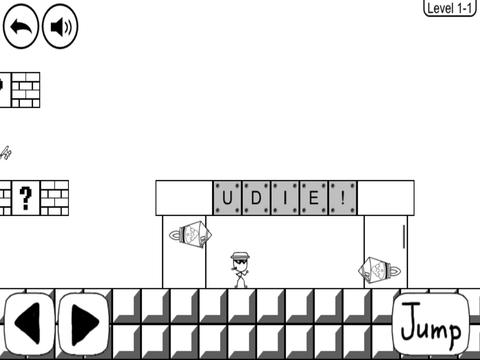
In the prior examples, the UI elements are for the core game mechanics. However in this case, Since it’s a mobile game, the developer simplified the UI to nothing but controls. It’s not a bad choice since the mobile platform lacks things like the D-Pad or the buttons. The point is that the recent trend of Casual Mobile games is to simplified the UI for gameplay, while Console games are making the UI an extension of the game mechanics.
In a way, the Casual game has simpler and simpler UI while the Serious games will have more and more stuff on screen (Yeah I’m looking at most of the MMORPGs) When you have little to do, obviously the UI should be simplified, but when you have a lot to do and see, a proper UI will going to be important.
So both parties are right here.