NMFORCE BLOG

Event Based Sound System – Project Blog #3

Last time we end our Project Blog #2, we left a question unanswered.

That is, since the limitations of Tango apply to our project, we cannot do our gameplay in a dim space, to act as substitute, we made the game itself super dim instead. However, the dim environment of the game world means that the player is very likely to miss something in the game world. As our core gameplay mechanics involves finding ghosts floating around in the room, and taking photographs of them while looking for key items, thus requiring knowledge of the game world.

Yay for conflict between gameplay and mechanics!

Of course, we need something to alert the player without letting them see.

Even though Google Tango is one awesome system, it cannot provide anything than visual and audio input. Since the visual input are out of the question, this left only with the audio input. Meaning that we can only tackle this problem soundly (pun intended).

So, we decided that for each event happening, in other words, when there are something that requires attention of the player, there should be a sound based on it.

Talking about sound, there are background sounds (BGM) and foreground sounds (SE). And that’s how they’ll work:

  • BGM
    • A background track, consisted of drums, bass and some percussion constantly plays in the background as the game’s BGM. The track is composed in typical slow beat drum & bass fashion so the player won’t getting bored listening to something without a melody.
    • However, when an event is fired by the system – A ghost appears or a key item appears – The track’s melody part, consisted of flute, piano and guitar would kick in, since this also changes the genre of the background music, it’s considered as a sudden and apparent change in atmosphere. Because of the unexpected change, the player is then realized something has happened.
    • This is achieved by recording the two tracks in different files, and while the files are both playing, the melody track’s volume is at 0 unless something happens which would increase the volume. When the event ends, the volume is reset to 0.
  • SE
    • A series of SE is prepared and is read by the engine as sound files.
    • Each SE is tied to a location within the game world.
    • When something happens, the SE that’s closest to the event would play. Its volume is calculated from the player’s position to the sound source.
  • Aside from BGM and SE changes, when an event occurs, there would be something displayed on the HUD to further reminding the player that actions need to be taken.

As of now, the programming of those functions are coming nicely. I had to say, Tango would not be a that good choice on horror games, due to its various limitations. It is more fitting as something that is exactly the same in real life and in the game world. For example. an library or a museum, where the Tango can be used to provide additional information based on the user’s location (e.g facing a specific piece of art, displaying on Tango the detailed information regarding said art). But regardless, our game is still coming nicely and I think we are doing the best we can on this.

So, until next time.

What they see, what they get

Recently, Me and my programming circle of friends asked our artist to redone the UI of one of our long-running game projects. What project, you may ask? Why, Battle Royale, of course! (Known as Hunger Games in English Versions).

While the changes detailed in this article won’t be pushed to the English version yet, I found our train of thoughts behind the UI changes interesting so let’s talk about it here.

So, what got changed?

(Both screenshots are from the Chinese Version of the game, but the exact changes are unrelated to languages.)

2016110650

Old UI

2016110706

New UI

Aside from the obviously rehashed avatar artwork, the biggest change is the font used to label the player’s status, together with the changes of the visible HP/SP gauge. Let’s talk about them one by one.

Font and color Issues

The old UI used a font that’s remain unchanged until just now. Originally when we’re programming the interface, we’re thinking of something really threatening. Since we want to direct user’s attention to their status. Especially the part where player’s current health status is shown. (Fine in Green text, Caution in Yellow text, and Danger in Red text) Then if the player is also inflicted with a special debuff, the corresponding debuff will light up in different colors.

However, recently some of the player just felt that something is not right, but cannot pinpoint where. As what I said before in this blog, you cannot let your player spell out the problem for you. So we performed some testing and find out the colored text sometimes dazzle the players for some reason (I mean, at least I don’t think anything got wrong…)

Well, it’s true that indeed the contrast of fully colored text on a black background seems to be unnatural, and after looking into some design principles regarding colors, we eventually choose white on black since that’s the most attention grabbing combination without the unnatural contrast.

However, we still need the Green = Fine, Yellow = Caution and Danger = Red color coding to preserve the user’s habits. After years of playing, I doubt any long time player would see the “big red text” without any action. That’s why we added the appropriate glow on the white text. Due to the text is now glowing instead of being pure colored, the original sans-serif font proves to not showing the glow enough, forcing us to change the font into a serif font.

Let’s put it this way – This is easy on the eyes.

Fill Vs Outline

After dealing with the color and the font of the status texts, the original HP and SP gauge now seems out of place due to lacking a glow and using pure, brighter colors.

Of course, our first thought regarding that is to just change the color of the fill to be deeper, matching the hue of the new glow.

Then, we found out that against the black background, the changed gauges now is hard to see due to their colors being too dark. Time to change that as well!

If filling something with dark colors won’t work, then let’s just create some highlights. However, to the old players, suddenly changing the human shape to always filled human shape only with highlights marking their current HP and SP provides to be confusing – The players has get used to the changing fillings, and now the fillings won’t change which is met by some negative feedback.

Facing with that, we reversed our line of thinking a bit. What if we don’t include the fills in the first place, and just used the outline as the gauge, and highlight the parts of gauge to act as the indicator?

To the players, the highlight acts like a filling of colors due to we made the outline much bolder compared to the early design.

Well, that’s the story behind the game’s recent UI change. Originally we only wanted to change the color of the text, but that eventually leads to more changes that resulted in a much different UI, as long as our players like it, it’s good for the game.

Until next time.

Okay then, let’s talk about my principle.

(Originally posted on March 9, after Lee’s second loss to AlphaGo, additional information and further analysis is added on March 10.)

(Disclaimer: I know more about AI than I know Go the game. My knowledge of the game merely came from some crash course betweens the rounds, if I made any error, let me know)

So, it seems my own principle, the sentence that I put on every other website of mine, is at stake.

“Human has unlimited potential.”

Now. if human has unlimited potential, how can it be defeated by an AI, especially on the most advanced game with countless possibilities?

In my opinion, AlphaGo’s victory today actually verified my theory: We humans indeed have unlimited potential.

To understand that, we must first need to know why AlphaGo can beat Lee in the game, and why AlphaGo is different from any other AI so far.

In our AI courses, we actually learnt everything we need to know regarding AlphaGo: Decision Trees and how to cut them, Machine learning and how it’s executed. With observation of the prior 2 matches, we can easily see how it’s different than many other AIs, and how some people’s expectation about AlphaGo is pure wrong.

What did we get wrong?

Firstly, AlphaGo does not follow any predefined patterns, in other words, it laughs at us human’s tendency of utilizing our experience in our decisions. Some people are stating one may be able to throw AlphaGo off by utilizing “an unusual strategy” and “something it never seen”. Lee is also thinking about it in the first game, so he used a very unusual starting hand. However, due to how decision tree cutting works, the strategy of “using something that threw AlphaGo in a loop” is never an option.

In humans’ eyes, a step on the go board follows one of the two. It either is a move that may change the course of the game, earning the player some advantage over their opponent. Or it’s a useless move that cannot generate any, or generate less advantage, and eventually would be caught by their opponent in a counter move. In other words, any move that’s not the “best” move is undesired.

So, some people thought of AlphaGo as calculating all moves to see if it follows a predefined pattern of moves, and make their move accordingly.

Truth is. there are no such patterns, there are only Trees.

In our eyes and experience, there exists a certain number of moves that may ensure advantage over our opponent. However, that’s not the case with AlphaGo. It is true AlphaGo’s network is trained using thousands of prior Go matches, however it’s used to develop its own policy network. The AI don’t care about humanity’s learning through experience.

When a move is made. AlphaGo forms and cuts the decision trees using the Monte Carlo Tree method, each evaluation happens in real time and is good only for that move, when a new move is made, a new tree is formed and analyzed, the loop goes on until any of the player loses.

There are no predefined anything, anything and everything is discarded.

In other words, you cannot throw AlphaGo off with something “that does not follow a pattern.” Because it does not have a pattern to begin with.

Secondly, AlphaGo does not want to win the most, it only wants to win. In the first matches, experienced player and professional players both points out that AlphaGo seems to make moves that didn’t “make sense”, sometimes the move will generate less advantage than others, sometimes the move has no apparent reasonings behind. Then their opinions are “AlphaGo seems unable to grasp the big picture”. Then it seems AlphaGo would always turn the table around and win with a very small advantage.

But is it?

According to Google’s Research papers, AlphaGo don’t really act like a traditional AI. In our courses about AI regarding decision trees, we mostly want the AI to follow the tree that has a better earning, in other words, we want the AIs to take a move that has a better advantage. But such is not the case in AlphaGo. AlphaGo seems to only take the decision that will make them more possible to win. Let’s take an example.

You’re an above-average student, taking an exam.

The exam has a total score of 100.

You discovered a week later that you got 80/100 on the exam. Impressive! You’re above average.

However, Mr. Jack beside you got 100/100 on the exam! That means to him, the exam is too easy to an extent that he can get full marks.

But, in another exam, where the difficulty is way harder, to the point that you can only get 40/100, Jack can only get 60/100. There is this Mary that got 80/100 on that exam, and since she has overall higher GPA, she got the scholarship while You and Jack are respectively above-average students and good students.

Simply put:

Average students get 80/100 because they can only get 80.

Good students get 100/100 because that’s the most they can get.

Best students don’t need to get 100/100 on every single exam, they only need to ensure they are better than good students.

AlphaGo firmly sits in the best category.

They win only by a small advantage, because they only needs to win, it doesn’t care about some advantage.

Come to think of it, in AlphaGo’s prior matches against the Europe Champion, Fan Hui, all matches also ends with AlphaGo having a small advantage over the Europe Champion. We could say that the AlphaGo in last October is not up to par to the AlphaGo today, but is it really the case here? Does AlphaGo win just because it could, it’s actually much more better than us, but it only wins with a small advantage just because it could?

Nobody knows.

We only know that this time, Lee has lost all 2 games, and while he surrendered in the 1st game, he struggles in the 2nd game’s last few moves, trying to find a way to turn the table around due to the AI only holds a small advantage, but couldn’t.

Lee has proved “out of pattern” tactics won’t work, and “taking advantages” won’t work either.

He still has 3 rounds to try to win, but I’m holding little faith in him.

Why AlphaGo would get 5:0 over humans, can we fight back?

If there’s a chance that Lee could win one round, it’ll be on Friday Night/Saturday Dawn, in the 3rd round.

After proven two of the most appearent tactics not working on AlphaGo, Lee’s selections of human-exclusive tactics become limited.

Can he exceed human’s limits and found out how to beat this AI, or he’s still proving that AlphaGo is, in fact better than us, only the Go board would tell.

But, I’ll put this here:

Humans has limitations in the form of physical limitations.

But Human has unlimited potential, and that’s why humans made AlphaGo, to go over our own limitations.

In other words, the mere existence of AlphaGo, proves that we Humans have unlimited potential.


…Until next time.

Clippy, a failure?

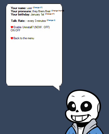
Most users of Microsoft Office would probably think Clippy, or the other Office Assistants are unneeded, which is why it and its friends are absent from Office 2003 onwards – Well, they are kind of hidden and need to reinstalled in Office 2003, and is totally gone in the later version. But is it really caused by users not needing the service they provide? I don’t think so.

Well, let’s see some of the similar assistants and we’ll go back to my statement.

What if we give Clippy more functions?

Around the time Clippy is hot as an not-welcomed Office Assistant, over the seas in Asia, a certain program called Ukagaka came out. The word is from Japanese where the open-source program originated, meaning “Something to be fed”. Another common term of this kind of program is Nanika, literally meaning “Something”. It look like this:

Yes, that’s sans from Undertale, a 2015 game. Outlived Clippy, heh.
Roleplay, Assistant, or random stuff, you name it.

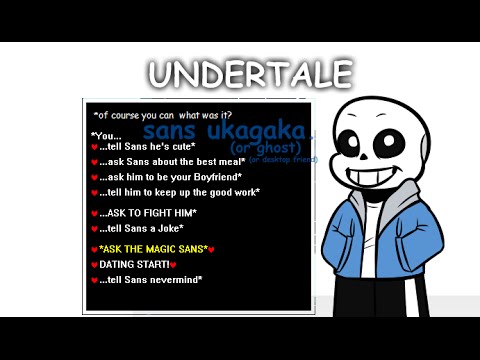
A Ukagaka is consisted of 3 parts: A Shell, that’s what you see – a virtual character on the screen. A Ghost, which decides the response and AI personality of the Ukagaka in question. Finally we have A Shiori (means Mark, as in bookmark), which is pure script programming to utilize the Ghost and link the Ghost with the Shell, together with all possible functions the author want to program. Finally, the 3 parts are processed by the Engine named Ukagaka to present itself onto the user’s screen, providing various functions.

Since any author could program the script in their own ways, and the script program itself being very extendable, those desktop assistants can do everything, from chatting with you, randomly start some topics or display some trivia, to useful functions like a calculator, a dictionary, a search engine, etc. It can also track user’s actions and respond to them accordingly. (For example, close itself with an animation and a “goodbye” when it has detected user’s shutdown computer command)

Guess what, people like it a lot! They like it so much that new Ghosts and Shells are being produced everyday by everyone. Take the screenshot character for example, he’s from the 2015 game Undertale. While the Ukagaka is a thing from almost 10 year ago.

Why? Because it’s useful? Well, let’s see something else then.

Also desktop assistants, but does nothing aside from being cute

Around the same time, or even earlier than Ukagaka, there is another kind of desktop assistant, or better put, “pet” called shimeji. The name is also Japanese and roughly translate to “placeholder”. They’re little animated sprites that hang around your windows and desktop, doing nothing, taking over your computer memory and just being cute.

Yeah, another Undertale inspired one, just to show it’s still popular now.

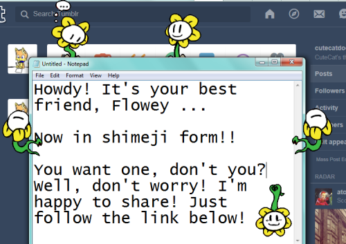
These little desktop pets don’t have any function, and is just coded to stick around based on the position of your windows and current actions. These sprites will do their proper animation when interacting with the desktop, for example, if you drag one off one of your windows, it will fall down onto your taskbar (or the bottom of the screen, if your taskbar is hidden), or when you’re writing something, it will look up or down as if looking at what you wrote. But only that, nothing more – these little guys don’t provide any function at all, and are just being there, hence the name “Placeholder”.

Weirdly, those are also highly popular, despite having a history of more than 10 years. Proving that yes, users could also like pets that hang around the screen for no reason and no function at all.

Then what happened with Clippy and Co.?

Let’s see what Clippy does.

When you’re writing something, it jumps out and ask if you want to write a letter, even though you’re probably not writing a letter.

When you get a word wrong, it jumps out and ask if you need more spellcheck options.

When you’re doing an action in Office, it jumps out and ask if you need any sort of help, no matter if it’s the first time or not.

The main problem surfaces – It jumps out on its own.

Neither of the above two assistants did that.

If a user wants help, they can always click the assistant. Or if a user just want a companion, they’ll also not wanting said companion jump out every two minutes offering unneeded help.

That’s the real reason why Office Assistant flopped. It holds a complete disregard to user needs, and would bound to disappear. Nowadays, the only trace of clippy is hidden as an easter egg in an optional setting, which is sad.

For me, i actually like them as a silent companion – Just turn all help off and let it watch me write.

Actually, it’s not Microsoft’s first time mess those assistant up, their first failure is in Microsoft BOB, but that’s another can of worms that I don’t really want to talk about here (Yes I used it, no it’s a huge failure).

So, until next time.

Trend of VR & AR, and obstacles

Recently, it’s true that VR & AR are becoming the hot topic. While there are already Youtubers showcasing the wonders of Oculus VR, and with Steam pushing their own VR hardware with HTC (Revealed very recently several months ago), the future of playing games seems to be very interesting.

VR and AR, where are we now?

The key difference between VR (Virtual Reality) & AR (Augmented Reality) is that while VR put the player in a virtual world using special devices (replace what they see and what they hear, and in HTC Vive’s case, also replace what they use with their special controllers), AR projects the virtual world directly in the real world. Currently, apart from the HTC Vive, which haven’t been released, VR devices still mainly uses traditional controls (isn’t it weird that you still need to use keyboard or game controller when you’re in a virtual world?) while AR’s limited usage is focused on displaying various information or bring virtual characters to life.

AR technology used in the 3DS Rhythm Game Hatsune Miku Project Mirai DX.
The real effect. The game supports taking a photo in this mode. However only through the 3DS screen can the model project onto real life.

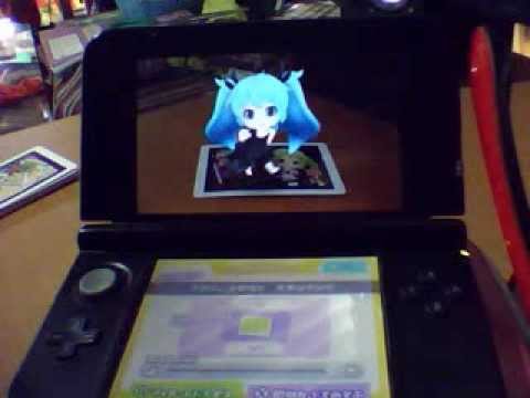
As one can see in the above screenshot. AR nowadays is as limited as VR currently is, the key to AR is that there needs to be some sort of vessel to project the virtual image onto the real plane. While Nintendo 3DS requires special AR Cards, it’s already proven that just printing the Card content on any surface would work due to 3DS displaying the models based on the content of the card. Similar AR technology such like Google Glass instead project the virtual data onto the wearable displays. In my opinion, AR technology has fewer problems to tackle due to Google Glass already did the job of enhancing what we see (and hear, if paired with an earphone). The only other problem is to iron out the cost of the system, and the convenience of said hardware (wearable hardware is definitely a right step). In the current form, Google Glass is still too expensive for everyday use, and its function is still limited, but it’s Google we’re talking about, so that would change in short time.

Current Problem with VR

While AR is more or less on the right track, VR on the other hand are having more problems.

The foremost problem is about the cost. In order to experience VR, suitable hardware need to be purchased. A key difference between AR and VR is that while AR only need one single device to use (a Nintendo 3DS is less than $200, think about it), in order to utilize VR, an entire solution, consisting of the VR devices, and a computer capable to run the VR apps need to be both prepared.

According to Steam’s recent statistics, there are only 5% of computers able to run a VR app smoothly. This is one key obstacle, if only 5% of the current users are able to utilize VR, then how many money does the rest 95% need to spend to upgrade their computer on top of the steep cost of the VR device itself? While it’s entire possible for Steam and HTC’s Vive, one could somehow got it to work with a Steam Machine. But Steam Machines are not cheap either: High-Ended devices could easily cost more than $1000, which is never a small cost.

Compared to the steep entry fee, actual programming of the VR apps would be the least of the concerns. However do note that to program VR apps, a system that is able to run VR together with that device is still needed, that still put the cost of producing VR apps much higher than intended.

So, my opinion on this trend: While both VR and AR are world-changing technology, one may still wait some time to fully enjoy benefits of them.

Until next time.

Limitations, and how to get around them – Project Blog #2

Now this should be more expected as I’ve already done one of them so this should require zero explanation, let’s go.

What happened after the last Project Blog

Unfortunately, we found out a series of limitations within the Tango, so some of the initial design choices detailed in my last blog has been discarded, along with some of the planned features.

For starters, Tango’s mapping of space is 1:1 based, for every inch in the game, we need to map out an inch of area in real life for the game to be played. This completely shot down the idea of multi-roomed floorplan due to we cannot find a place that large in our school, or anywhere else for that matter. Additionally, because of this exact reason, it will create problems in our upcoming presentation and everyday testing due to needing a fair amount of empty space, which is not easy to come around between classrooms and force us to test our game in bigger areas. Even with greatly undersized room size, we still need a space to move around. Also we cannot undersize the room any smaller (to fit within the classroom) since that would defeat our core mechanic.

In the end, we shrink the original apartment down to an cabin with some clever placement of walls and other elements to fit with Tango’s limitation. We also simplified some other core game mechanics to fit with the smaller scope.

It’s entirely possible, if having enough time and budget, to fully map out the space for a full apartment room. However with the current time and scope, this is totally impossible.

Another problem with the original design is a bit of an irony. Prior in the design phase, we have already decided that if we want to effectively scare people. we should have the player play under the dark, i.e without any external lighting. However, we soon found out that Tango uses light to track player movement and more importantly location. Oops.

Of course that is easy to fix – If we cannot make the player play the game in a dim environment, the only way is to make the game itself dark. Of course, making the game dark meaning there needs to be something that tells the player about their surroundings due to the dim lighting would easily cause player to miss stuff. And we don’t want the player to miss anything especially in a gameplay focusing on finding things in the dark. We’re going to work out something from that.

Other than the limitations discovered (together with the one that Tango didn’t work well with heights but I thought I covered that already), our project is going smoothly according to the original design document.

Until next time.


When you get problems, Just Ask!

Okay, time for something interesting.

Interviews and surveys are always interesting due to several reasons.

Firstly, most people are biased, and if nothing is done to tell them apart, we’ll get nothing but counteracting opinions, which is always bad.

Then, people tend to make their answers looks good or more towards the good part, especially if limited time is given, or the people doing the interview has a promised return but the interview/survey itself is not as interesting.

Because of those factors, an interview or survey should be crafted in a way that it spark the interviewer’s interest too.

Earlier, we already talked about human’s attention, or the lack thereof. While giving them prizes for completing surveys is a valid way of doing things, it would often leads to a heavily biased answer just for the quick prize.

Another valid way of doing things is to only cater to the people who would properly do the survey in the first place. Namely, there are lots of gamers that would agree to left down their impressions if they know their input would ultimately make the game a better one. This would at least get rid of the second possible flaw.

Then, it’s just the art of asking questions, or in other words, conduct a evaluation.


Talking about why, what, where and when

Why?

Normally, we need to know if our game matches the player’s requirements, and more importantly, if they like it and why.

For example (and I’ll use this game of mine a lot in this blog article), my own PHP Web Browser game, Battle Royale, is liked by players because it’s simple text-based MUD. It’s portable, meaning as long as there are internet access, one can play and drop out at any time. There are very few thing to download due to most of the game is text-based. Plus, the game is very fast-paced, which in turn means less time investments to play.

What?

We usually use a prototype of the game we’re making. In Battle Royale’s case, since the game is constantly updating anyways, we just use a production version of the game. The survey is located at the page bottom, any player can do it when they got time.

Where?

The location of the evaluation is important for some projects due to the evaluation needing more data. I could see the spooky house project being one of them since we’re working with devices and such. For Battle Royale, its MMORPG roots allows the evaluation be placed anywhere, due to we don’t need a lot of information and most of the information we need can be gathered from online means.

When?

It’s usually not a good idea to set evaluation sessions within the gameplay process because that would broke the immersion of the player. Personally, I’m a little uneasy with placing the evaluation before the game session either, unless it’s for prediction purposes (e.g. What do you think this game may about, etc.) since I found the idea of waiting to play a game – need to fill out something to play a game – seems counterproductive. Then again, in Battle Royale’s case, the survey link is always at the bottom of the page and one can access it at any time. From my observation however, most of the time it’s accessed after a player died in the round and is waiting for the next one to start. So my opinion isn’t alone, it seems.


In Battle Royale’s case, the data gathered from evaluation directly influences the next updates. From the replies, we can understand what our players want, and update the game to include more element they want. This also contributes to the game’s player groups since in their eyes, we as game developers actually hear what the players are saying, and is willing to change up our games for them. This alone earn us a lot of returning players.

However, there are more in it than just asking Why, What, Where and When. The last W, Who, is also an important matter.

As we discussed two weeks ago, there are lots of types of players, and each type is likely has their own requirements. It’s nearly impossible to produce a game that make every single player group happy. In Battle Royale’s case, what I did is before the actual survey, additional questions are added that seems random to the players but is actually testing their play style of the game. The results are then grouped into their respective play styles, with each play style with a different set of data. While this seems to be more work as I’m compiling the data multiple times with this approach. It proves to be useful in the long run as we can cater the game better to the type of players who enjoy playing our game.

In case this blog article is too egotistic – Of course I knew a lot of different other games that makes use of a good evaluation system. However, some of them are too complex while Battle Royale’s player group and developers are much closer. In larger games with more complex evaluation methods, the observation of evaluation result versus game changes usually takes longer time than intended. Recently as Battle Royale’s user group and servers growing, we too has this small problem of data coming in slower than we originally thought since we have more source of data but still the same resources to process them.

Well, this is for this week, for now.

Until next time…

How to scare people – Project Blog 1

Okay this is a little unexpected, isn’t it?

Since I got placed in a project group that deals with a spooky house game, I think I may write on that instead of user interviews. There are always next week to cover that topic.

Compared to the last few entries, this one would read more like a note, this is normal since I’m basically writing what I think first-hand.

Now, the concept of spooky house game is very vague. In a sense, the “Resident Evil” series of games, especially the first game, is a spooky house game, only instead of ghosts, the enemies are zombies. Then we have “Corpse Party”, a recent unique spin on Survival Horror by introducing some of the elements from adventure games. where players need to make selections and actually decide on what to investigate which alters the story and coming events.

As I’m looking at the requirements and doing the design, I noticed something very interesting. We’re using Google Tango, a device that allows for motion tracking and depth perception. So naturally, we want to make maximum use of those unique functions.

The inclusion of those functions can be used to properly simulate navigating inside a complex house with rooms, stairs and corridors. I admit the mansion in Resident Evil 1 crossed my mind for an instant when I realized this, then I reached the conclusion that a mansion as large as that one is not the best choice since that would greatly out of scope and is entirely impossible to do.

So what I do instead, is to use a software that centered on home creation to draft the mansion we’ll use. It can be treated as a certain way of prototyping since this only conveys the design of the house (the real house in the game would of course be a lot dimmer, a lot more evil and actually with ghosts)

2016022614031420160226140348

The Prototype Apartment drafted in the software. Showing what room goes where, structure of the rooms, etc.

Of course, everything would change in the later prototypes.

With the concept out of the way, the rest is to decide how the narrative should go. I initially thought of a 2 player narrative where 2 main characters need to navigate the house from different locations with different goals. However since we only have 1 Tango unit available, that idea has to be discarded. So instead, I came up with the different types of ghosts we need to interact with (together with naming them):

  • Chasers, which stays true to its name sake, chases the main character when discovered. When you’re caught by a chaser, bad things happen.
    • As for what bad things, it depends on the ghost entity. Personally I’m against jumpscares especially if they jump out from nowhere, though my teammates love that idea…
  • Reactors, which reacts to the main player’s actions.
    • It’s the more puzzle like of ghosts, and will only be resolved by solving puzzle-like challenges in the house.
  • Triggers, ghosts that just being there and would disappear once requirements has been met.
    • Basically gate that stop players from wandering around.

The core game mechanic would be to capture those ghosts with camera or some other tool, while navigating the house and not being captured by the ghosts, simple enough.

A simple mechanic leaves less room for error and makes sure that there are less to none room for player confusion.

Of course, everything still has a possibility to change based on the functionality of the Tango unit, the time and resources we have, and other factors. We’re still at the point where changing stuff won’t hurt much towards the developing of the project, so personally I’m not against any changes, and I’m always ready to fix and shuffle up the initial designs if it helps.

Hmm, maybe not the “Jumpscare-Game Over” mechanic, that mechanic has been done to death and won’t be effective if it always happens.

That concludes today’s project blog. Next week we’ll come back to user interviews.

So, until next time…..

Players – How to read their minds

Yeah the title is supernatural like that.

Last week, we looked into some factors that will grab player’s attention, and make them less confused. When the players know what they should be doing, it’s time to ask them what they really want.

So, how to know what they actually want?

However, what we human sees are often not what we really want. And human’s desires would sometimes lead them to a less better choice. That’s why asking the players directly for their ideas is not usually a good idea. There will be so much suggestions that would counter themselves due to each player has their own view on things.

Luckily, there is a way to break down various game design elements down, and that is Heuristic Evaluation (HE). It’s a set of standards and guidelines that can be compared to. Namely, we compare our game’s game design elements to the guidelines and see if anything violates them. If something does, that “something” would probably also turns out sour in most player’s eyes.

Obviously, there are multiple sets of heuristics since a single set of heuristic cannot cover everything. Normally, when we’re evaluating a game, we choose the heuristic that fits best with the game. One can actually treat the different sets of heuristics as different sets of players, and It’s only natural to pick the appropriate group of players when evaluating games.

Since this is only a blog article, I’m not going to do a heuristic evaluation of any game here since that’ll probably take pages and pages. There are other evaluation methods than HE though.


Another way of conducting evaluation to see if a game would come out right is to use Cognitive Walkthrough. It’s the practice of walking though the task from the user’s perspective and noting problems. While this sounds like basic, in fact I’ve seen a lot of game developers failing to realize that what they see and what they test are usually not what the player may see. For example. the MMORPG Champions Online boasts a Freeform Power System instead of regular Classes. In this system, players can freely choose, mix and match powers from different trees, creating the character they want to be. In the process, some players naturally choose a set of powers that are good in both offence and defense (In other words, meta). Everything worked fine until the game becomes Free to Play and a system that’s similar to the traditional class system is implemented for free players. As the entire game is balanced off the freeform system, the non-paying class-system users are having a very bad time. (Luckily, they’re solving this problem by more testing in between updates and make sure free users can also enjoy the content.)

In the above example, the reason why the game was suffering problems is that there are no indication anywhere that if contents are balanced towards whom. Initially, the developer’s approach is to try simply nerfing the difficulty of content to match the non-playing players. But then the freeform players start to dominate the content due to their advantage. The final temporary solution is to clearly label which area is for freeform users,  Until the re-balancing happens this small UI tweak seemed useful. While the balancing is a serious and hard matter, player’s exception can be somehow manipulated through the UI changes that give the players the feeling of belong.


Last week, I talked about player perception and how it could be manipulated. Usually, we’d want our representation to be perceivable without confusions. In the above example, the problem is caused by a game-play balancing issue. However, by splitting the player groups that are on the 2 sides of balance, a temporary solution is found. By simply labeling the balance of the content, the player could use the information to avoid content they don’t want. This is a clear case of manipulating the player’s perception by making everything clearer. While the players may not know what they want, we game developers can at least steer them into the right direction.

Of course, the better way of doing things is still to determine what the player’s requirements actually is, clever alternatives cannot work forever.

Getting those requirements out

There are different kinds of players, and there are lots of definitions of each type. To laying down the requirement, we must first determine what types our players are consisted of.

                                  ACTING
                  Killers            |                  Achievers
                                     |
                                     |
                                     |
                                     |
                                     |
          PLAYERS -------------------+------------------- WORLD
                                     |
                                     |
                                     |
                                     |
                                     |
                  Socialisers        |                  Explorers
                                INTERACTING

The 4 Playing Approaches in Online MUDs based on player interest. From http://mud.co.uk/richard/hcds.htm

The graph listed above is one of the ways to determine the types of players. It works on MUDs and by extension most of the MMORPGs. The different kinds of players will find different aspects of the game to be fun and interesting. For example, while the Killers would be more concerned on the balance of various powers in the above Champions Online example, Socialisers would care less than that and only care about how to Role Play better. That creates two kinds of requirements that’s far different from each other.

With different sets of requirements in mind from analyzing the types of players, one question remain – How do we know if one set of requirement is more important at hand?

It seems some direct data gathering is in order, which would be what we’ll talk about in the next blog.

Until next time….


Players – How To Not Mess them Up

If there’s one thing that is well known within the circle of game developers, that is the players of their games are very, very hard to please. It’s true that game developers and designers aren’t telepaths and know everything the player’s thinking, but that still didn’t justify player’s actions sometimes. It seems they always have the way of getting the intentions of the designers wrong, then come back and blame the designers for everything they haven’t done wrong.

In other words, no matter what the developers do, there are always someone that’s not happy.

While this is indeed a very sad matter, there are ways to get around that.

Remove unnecessary stuff

We humans may have unlimited potential, but we do have limited attention. Most of the time, we don’t need every single piece of information, even if it’s something that seems important. One example comes from the Mega Man series. The first game in the series feature a score counter that’s shown on the top of the screen, there’s also an item that when collected, adds up a multiplier at the end of the stage which gives more points. Each Robot Master also comes with a Clear Point. (and I must add, I don’t know why some of them are higher than others when they’re equally hard, maybe that’s just because of me.) Then, Capcom found out that this game is so difficult that clearing the game is a feat in itself, and since score is only calculated from enemies and boss destroyed and multiplier items gotten, meaning people are going to get the same range of score anyways, later Mega Man games do away with the scoring system altogether, and never speaks of it ever again in all Mega Man games after that. (Well, some of the other spin-offs has a rank system, but players with better techniques are getting higher ranks thus make the system actually useful)

Obviously, Mega Man Series get away with the entire score system is just a Special case due to the game’s difficulty and linear gameplay. In most of the games, it’ll be confusing to throw every single unnecessary mechanic out. Thus, the more accessible way of managing unnecessary data, is to keep them under the hood so players can direct their attention elsewhere. A common practice in STGs (Shoot’em ups) is to blur out the HUD Elements when the player sprite is on top of them. Since the player’s current location, together with the bullets’ current location are something players want to have more attention directed to.

Make necessary stuff stand out – But not too many

While we’re still on the topic of STGs, it’s not uncommon for these games to notify the player, either by audio or video means, that they have extra resources. (Bombs, Lives or Power-Ups) which stems from the similar practice. The reason being that while we want to keep the user’s attention on the main gameplay, we also want to direct their attention to their available resources when these changes. Now, if they actually used said resources, they’ll get feedback in the form of actually using resources – It’s only fair that they’ll get some kind of feedback when things go the other way.

So we let the unnecessary stuff become hidden, and the core stuff becomes the center of attention. Then for the really necessary stuff, we’ll just make it stand out so it can grab the user’s attention.

Note that this tactic, while seems cool on paper, has a big chance to mess up if the player don’t know what to do. For example, say there’s an adventure game with some puzzle elements. The player is now facing a control panel full of buttons. Suddenly, a red button lit up. Most of the players will then reach for the red button since it grabs their attention. Then, after doing that, a green and a blue button lit up together.

Now the player is confused – which button should I press? The green one, the blue one? Or press them together? While the player is busy thinking about that, the control panel exploded due to inactivity, killing the player.

This exact practice is actually popular in older adventure games. However ultimately the trial and error approach would leads to more angry players than clever or lucky players that figured out the correct way in the first few tries.

In short, don’t overwhelm player with big number of “necessary stuff”, in most of the cases, one is enough. If absolutely needed to do two or more in one go, try using some way to warn the player (a.k.a grabbing their attention) first.


We can actually continue talking about perceptions and how that’s also unreliable, but for a specific reason, we’ll leave this to the next blog.

In the next blog, we’ll talk about how to extract what the player really want from their feedback. Yeah, this totally seems like telepathy now…

Until the next time….